← Our work · Adriaan Bogert Bouw
Adriaan Bogert Bouw
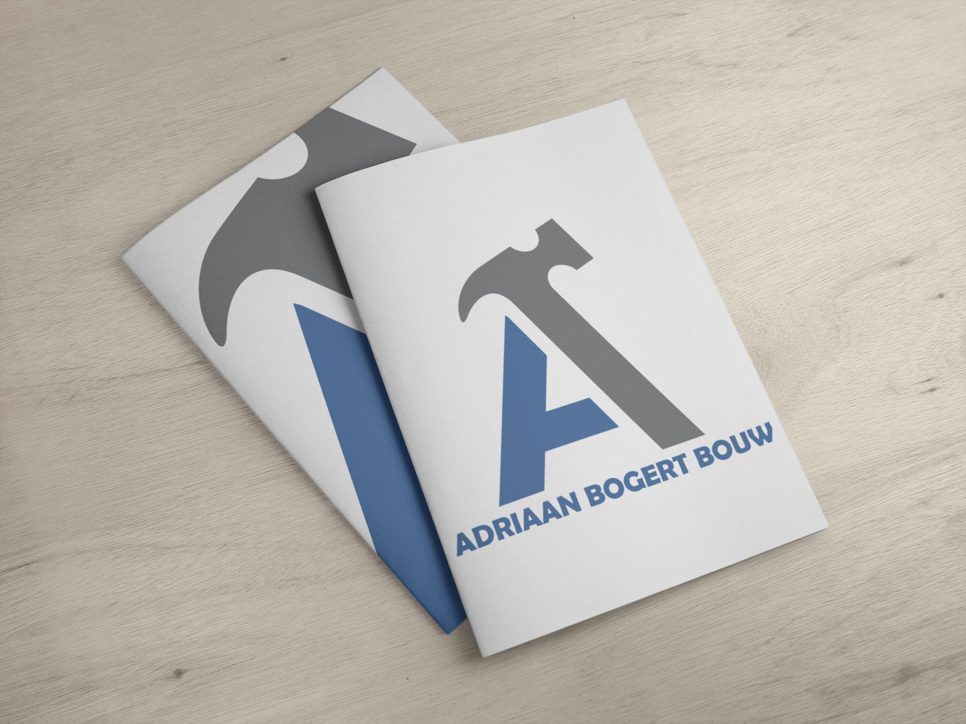
A strong logo for a solid construction company
For Adriaan Bogert Bouw we designed a new logo that fits the core of the company: craftsmanship, reliability and solidity. In construction everything revolves around trust. A logo has to radiate that immediately — no frills, but with strength.
The challenge
The logo had to:
- Be professional and recognisable
- Clearly reflect the construction industry
- Stay timeless and strong in the long term
- Work well on vehicles, workwear and print
- Come across strongly both digitally and offline
Our approach
We started by defining the identity of Adriaan Bogert Bouw:
- What type of construction company is it?
- Which target group does it address?
- Should the logo be sleek and modern, or robust and artisanal?
From that strategic basis we developed several concepts, paying attention to typography, balance, recognisability and scalability.
The result
A strong, professional logo that:
- Radiates trust immediately
- Works perfectly on company vehicles and materials
- Looks consistent online and offline
- Lays a solid foundation under the brand